Persona Case Study

Persona is a company from South-Africa created in 2007 selling affordable high-hand luxury handbags. Their products are made by local artisans using raw natural materials and highest tested quality, full-grain analine leather to ensure an ethical footprint. For this first case study, we will examine different aspects of this business:
1. Branding
Logo
The logo is not clearly identifiable. Is it the lion displayed on bags? If so, it should also appear on the top left corner near the brand’s name so that customers can easily associate it with the brand.

Let’s assume their logo is the lion:
- Is it appropriate?
Persona is an African brand and a lion definitely evokes Africa but it also evokes royalty which is appropriate for a brand that wants to be perceived as a high-end.
- Is it simple enough?
This logo probably has too many details to be considered simple. While we can immediately recognize a lion, people wouldn’t be able to redraw it by memory. It’s simple enough to be recognizable when you see it several times.
- Memorable?
Simplicity helps with memorability but a lot of famous brands use lions as emblems which makes this one not unique enough to leave a strong impression on customers. For example, the clothing brand Mossimo uses a similar logo (https://en.wikipedia.org/wiki/Mossimo) which could also be the source of legal issues if Persona’s go starts selling internationally and expand its offering.


- Is it versatile?
Since this logo has a lot of details, it doesn’t look as good in large than in a small format. It’s also difficult to reproduce the same amount of details on fabrics. It looks good on the web but it could be better on fabrics (maybe removing the white space inside the lion would help) which is essential for this kind of brand. It also fits easily in a square which makes it perfect for the Web (example: bookmark icons) and will style looks good in black and white and in large and small format.
Positioning
Based on their own description, their niche market is high-end affordable leather bags in South-Africa. Let’s try to take a look at the different options available when searching for leather bags :
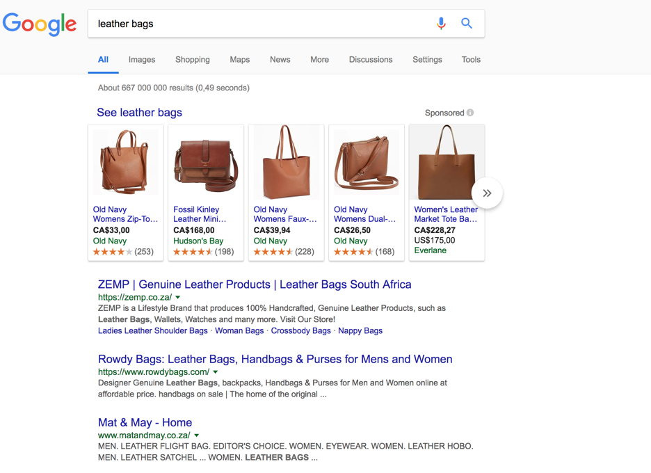
A quick look at those 3 different stores shows me that they offer products at a similar price range. As a potential customer, it’s not clear to me why Persona should be a better option. Is it the design? The quality of the fabric? The origin of the fabric? The creation process? Being able to answer this question will help their positioning and refine their niche market.
Trust
Convincing your customers to give you their credit card number requires a lot of trusts. They did a lot of things right:
- Their shop is secured with SSL
- They have their own domain name
- They have a professional email address
- They have high-quality pictures
Here is how Persona could improve their website to inspire more trust:
- Add an SSL security badge or/and payment secure badge. Here is how it can be done on Shopify: https://help.shopify.com/en/themes/customization/store/add-security-badge.
- Their About Persona section is good but it could be better with a short description of the team as well as a picture of them. By adding this, the website will look less anonymous.
- Add a privacy policy, refund policy, return policy and shipping policy with a link to the policies in the footer of the landing page.
- They do provide a 2-year warranty on their products which is great but it’s only mentioned at the bottom of the About section which means that almost nobody will see it. Their products also offer many advantages (high-quality material, ethical footprint, …). Adding a section on the main page with a row of small icons describing each of this advantage would definitely be more visible than the current About us section. Adding a 2-year warranty badge on each product page would also ensure that nobody misses it.
- In terms of social networks, they do have a decent number of followers on Instagram which inspires trust. Their Twitter and Facebook community is very small which probably have a negative effect on trust. In order to quickly increase the size of their community on Facebook, they could try to run a Facebook Ad Campaign to increase likes (which also increase followers). If you run it well, it can be extremely effective. For our own store, AINAC (http://www.ainac.fr/) (not opened yet), we spend $2/day on this kind of campaign. As a result, we get 1000 new followers each week. Their Twitter account doesn’t seem very active as well (very few tweets) and doesn’t seem necessary. Removing it completely would probably be better for their business. You don’t need to be on all social networks but you should focus on those where you can attract more customers. Try to avoid wasting your time and energy.
- Adding a live chat on their website and on their Facebook page (you can use Facebook messenger for both) would be great for customers who have questions and wants to make sure that the store is legit.
- Adding a phone number and a physical address (even if it’s the factory address) is definitely a must if you want your business to look professional.
- If they have a lot of customers, adding a product review section on each product page will add some social proof to their business.
- Powered by Shopify displayed in the footer section looks amateurish. They can easily remove it by following these instructions: https://help.shopify.com/en/themes/customization/store/remove-powered-by-shopify-message
- An FAQ section is necessary so that potential customers can look for answers when the live chat is not available.
2. Design
UX
- People don’t read on the web (or almost), that’s why it’s so important to write short sentences on most pages. They did great on the slideshow but the About section should be displayed on its own page because it’s large and it prevents customers to view their products immediately. The text on the slideshow should be their selling point. What is so amazing about your store that I should buy from it instead of your competitors? This is where they should try to convince their customers.
- Once you scroll, the navigation bar is not visible anymore which makes it difficult to browse through this online store.
- They do offer several modes of payment which is good but adding Paypal would be great (if it’s used in South Africa).
- Adding the navigation links in the footer section would improve navigation (especially if the navigation bar is not visible anymore)
- Their social network links open in the current tab which is a problem since customers leave their website. We know how difficult it is to attract them in the first place so you should avoid this kind of external links at all cost and replace them by links that open on a new tab.
UI
- In terms of fonts, both their fonts are beautiful and easy-to-read. They are also very different (a sans-serif for buttons and a serif for paragraphs) which makes it very pleasant to the eye.
- There is a good contrast between the text and the background.
- The color scheme of the theme used is very sober (black, white and grey) and discrete which makes products stand out. Great job!
- They don’t have a favicon which is absolutely required on the web. This favicon should be their logo (the lion?) otherwise people who bookmark their website can’t identify properly.
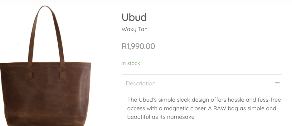
Product pictures
With a quick glance, their product pictures look good. They seem professional, with good luminosity and no distracting background. Their product pages have a lot of pictures so you can really see the product from different angles. but a few things could be improved:
- When you enlarge some of their pictures, you will notice a grey background or a kind of shadowy background. Keeping the background completely white would add some consistency to their pictures.
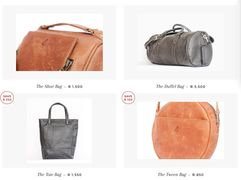
- Talking about consistency, keeping the same type of placement for all products will make their website look more professional. If you look at their landing page, you can barely see the shoe bag and the tween bag:
Their competitor ZEMP got it right:
Persona would gain a lot to study ZEMP or other competitors and get some inspiration from them.
3. Marketing
SEO
- When you write product descriptions, you want to have as many keywords as you can so that people can easily find your products. Their current product description looks like the specification section of a product. It’s not enough!
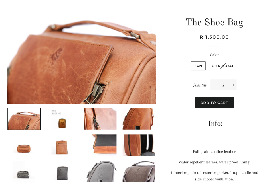
They should definitely add a more compelling description of their product. Again, ZEMP got it right. They have a small description and a specification section :
- Their product URL is readable but could be improved by adding 1 or 2 keywords inside it. For example, the products/shoe-bags URL could be products/leather-shoe-bags so that people who look for those keywords have a better chance to find this page.
- They do have alt texts on their pictures but it seems that it’s always the same. They should make this alt text more precise to increase the number of keywords targeted (example: charcoal leather shoe bag, tan leather shoe bag, …)
Social networks
- Persona’s Instagram account is very active (daily posts) with amazing lifestyle pictures that are inspiring. They did a very good job!
- Their twitter account seems dead which is why customers could also think that their business is dead. It doesn’t bring any value so why keep it?
- Their Facebook account is just a repost of the Instagram posts which could explain why so few people follow their page. Facebook and Instagram posts should be completely different. A Facebook post should have a short description, a call-to-action, a catchy image with your Brand’s name and/or logo on it, … It should be enticing enough so that when it appears on someone’s feed, he/she will click or share it with his/her friends. It’s better to post high-quality content less often than creating a copy of your Instagram feed.
4. Technical aspects
- Pingdom test
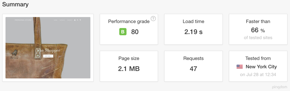
Persona’s website scored pretty well on Pingdom both for the landing page and the product page.
- PageSpeed Insights
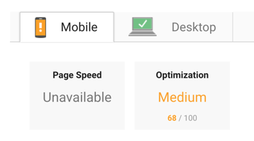
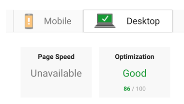
They scored pretty well on the desktop test of PageSpeed Insights but not so well on the mobile version. Some technical improvements like improving browser caching, optimizing images could improve this.
This concludes our complete review of Persona.
Do you want a case study of your own online store?
Just send us a request at info@nowinstore.com