Everything You Need to Know about Printing Catalogs
It is an open secret that catalogs can be very effective ways to sell things to your customers – whatever “things’ might imply in your case.
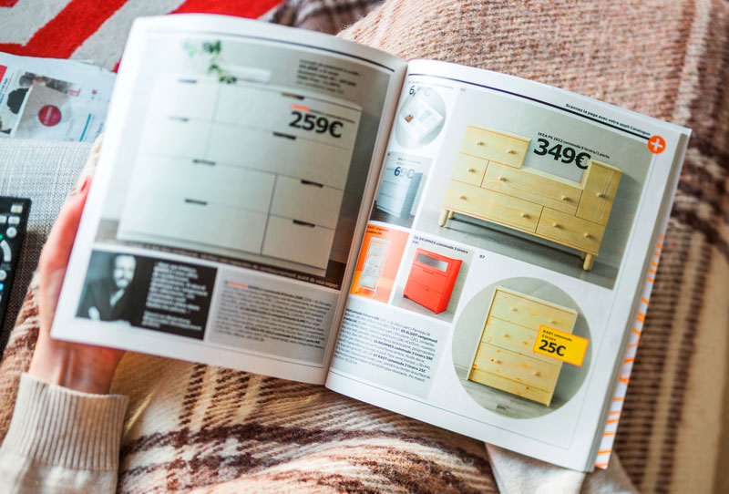
If you are a business owner and are searching for a good avenue to promote your offering, try using a product catalog sometime. This is a very effective marketing tool, and unless you are a large company that needs to ferry models to far-flung locations for photo shoots, one that is relatively inexpensive too.
The big issue seems to be how to create compelling catalogs that sell; how to get those products or services onto the shiny pages of a new catalog. It is a question we get too often from our customers, and understandably so because the design and layout of your catalog has a direct bearing on your sales.
If this is something that has kept you up at night, it is time to cast your worries aside, sheathe your pitchforks and extinguish your torches. This guide aims to walk you through the basics of printing catalogs.
First things first…
What is a Catalog?
The meaning of a catalog will differ depending on whom you ask because what some may call a catalog, others may refer to as a brochure.
At its most basic though, a catalog is a complete lineup of the products or services a business offers, often in systematic order, complete with images and descriptive details. You will often find the name used interchangeably with line sheets, but a line sheet is basically a dumbed-down version of a catalog.
For the sake of clarity, it’s also good to point out that it differs from a brochure in the sense that a brochure contains information about the company, with the mention of a few selected products or services. Like a pamphlet.
Designing your Catalog
A well designed catalog or line sheet is all about smart layouts, dazzling images, gorgeous design and an organization that comes across as spick-and-span.
These are the building blocks of a good catalog which may sometimes be determined by the industry you are in, each different from the other.
For example, the layout of a jewelry store’s catalog will look different from an apparel business’ or medical supplies’. Let this be foremost on your mind before you dive right in, for in this world, one size does not fit all.
Tailor your catalog or line sheet to appeal to your target customer because its performance will be directly tied to how well it sells.
If your target demographic comprises a young audience, the catalog needs to be drastically different from one meant for an older clientele. If you target multiple audiences, then it might be a good idea to make multiple designs to appeal to the different styles and desires.
Size and Format
One of the first decisions you need to make when designing a catalog regards the size and number of pages it will feature.
Normally created on a PDF layout, you need to format the PDF in such a way as it is large enough to showcase all your products, while drawing attention to the most important offerings.
Here are some standard catalog printing sizes that should serve as a basic guide (size in inches):
- 5.5 x 8.5: These are for tall and slim catalogs, and they are great at showcasing images of products with just enough space for a pithy description. Jewelry and watch companies mostly use this.
- 6 x 6 up to 6 x 9: These are either square or rectangular depending on measurement. They are mostly used to describe low-volume products/services without a lot of features.
- 8.5 x 11 up to 9 x 12: A size mostly used by clothing and apparel businesses, but the 8.5 x 11 size is universal.
- 12 x 12: Largest standard catalog size and is ideal in cases where there is a large number of products/services to feature (think supermarket or departmental store catalogs).
The secret to choosing a catalog size is establishing beforehand how much information it needs to carry. Obviously, a bigger-sized print is ideal for catalogs that will feature lots of pictures and text, if one is to avoid the mess that is congestion.
Also, you don’t need to feel boxed-in by these dimensions as you always have the choice to go custom.
There are a few programs you can use to design your PDF outline:
- Adobe InDesign
- Adobe Illustrator
- Adobe Photoshop
- Microsoft Publisher
Each of these programs has its own strengths and drawbacks, and the best will always depend on whom you ask. The more adept you are in one, the easier time you will have designing from start to finish.
Overall though, they are all great ways to design your catalogs or line sheets.
The alternative is to use third-party services such as our very own online-based software, Now In Store.
The beauty of this solution is that is absolves you of the need to design from scratch because the structure has already been done for you; all you need to do is flesh it out as you so desire.
For this reason, it is a solution that will not only prove a time-saver, but also cheaper. Plus, it can be used by anyone – even those who do not consider the technical aspect of design a strongsuit of theirs.
Enriching your Catalog: Image and Graphics Quality
Your product or service images are the centerpiece of your catalog, arguably the most important part.
Always aim for high quality images, whether you are photographing the products yourself or hiring a photographer to do it for you. By high quality we mean large, vivid images with a high resolution of 300 DPI (dots per inch) or above. This ensures their quality is not compromised when it gets down to the actual printing.
Another thing to remember with regard to image quality pertains to color palette.
You’ve heard about the psychology of color, right?
It is an extremely powerful influencer of perceptions that may not be obvious, color. Its power is such that it can completely alter a person’s experience of a product or brand, hence the need to play with it in your catalogs or line sheets as it goes a long way in determining consumer choices.
When printing catalogs or line sheets, two color models you need to be aware of are CMYK and RGB.
Not that you need to understand every little technical aspect of this to be a good visual communicator, but at least you should be aware that each of CMYK and RGB are used for different media.
CMYK, initials for cyan, magenta, yellow and key (black), is best for catalogs that will be printed on paper. But if the catalog will be restricted to digital platforms, then RGB (red, green, blue) is the better choice.
RGB designs printed in the CMYK colorspace don’t look the same because the latter does not include all colors in the spectrum of its counterpart. Since the RGB colorspace covers the entire CMYK colorspace, however, it’s possible to clearly display CMYK on a screen.
If this sounds nerdy, here’s the important bit you need to keep in mind always:
When designing files for print, always use the CMYK colorspace from the onset.
The trouble with designing in RGB for print files is that the colors might be a little off when you convert to CMYK.
However, if your catalogs or line sheets will be based on digital platforms alone, RGB should work just fine.
Trim, Bleed and Margins
This is the most crucial concept of a print job when printing catalog PDFs because everything else has to do with either adjustments to enhance quality or technical application guidelines.
So, what is the meaning behind these terms?
Trim
Is the part where the PDF will be trimmed/cut. It is wont that in the process of keeping all papers in check, one might be a millimeter shorter than the next.
In the event that the catalog or line sheet is double-sided, the second side will not be printed at the exact same spot as the preceding paper. Consequently, this will be apparent when cut.
But this is a problem that can be washed away by bleed and margins.
Bleed
Bleed is an essential function that allows the product to be used even when the print shifts. It is the area past the trim edge which ensures any content that may be touching the edges doesn’t leave unsightly paper borders or gaps.
A standard of 0.125 inches (3mm) of bleed is recommended on all sides of your design. This addition makes up for those unavoidable shifts that occur during the printing and trimming process.
Margin
The safety margin is that additional real estate from the trim line that prevents important text and graphics from being trimmed as a result of slight shifts which may occur during the production process.
Margins differ from bleeds in that bleed is the outer safeguard while the safety margin is the inner.
As far as the recommended margin to use goes, while the average minimum margin for printing often revolves around 0.125 inches (3mm), anything upwards of 0.205 inches (5mm) should work on most occasions.
Printing Paper
Another crucial decision you need to make when printing catalogs is the type of paper to use. The type of paper you decide to go with will have an impact on the overall success of the catalog.
Poor quality paper will leave a bad impression on your readers, that’s a basic tell. But good quality catalog paper will urge them to keep turning those pages, with your vivid images of choice popping off the pages and into their imagination. This, in turn, has a higher chance of culminating in a purchase.
Ideally, the paper you use to print your catalogs needs to be fresh on the eye, crisp to the touch, and overall sleekly appealing. You can also throw durable in there.
Uncoated paper
Also known as white offset, this type of paper has no coating or extra finish, as redundant as that may sound. It makes for poor printing paper for catalogs, line sheets and brochures.
It is the type used to print books and best used in stuff like pricelists – no frills, just business.
Coated paper
This type of paper feels smoother and looks shinier and can be classified as either light, medium or high coated.
Coated paper can either be glossy or matte and creates magnificent color results, making it perfect for catalogs, line sheets, brochures and other products like menus.
- Gloss
Glossy paper has a lot of shine and its texture resembles that of a glossy magazine. For this reason, it is just the go-to paper for printing catalogs where you want to showcase your products in all their colorful splendor.
UV gloss coating especially enhances color contrast and results in a gorgeous shiny finish.
- Matte
A matte finish also enhances your visual designs by providing a light coating without much glare.
It is also an ideal option for catalogs, and while it has a slightly rougher texture than its glossy counterpart, it is much softer in appearance.
There is also the issue of weight with respect to paper. A good quality paper can be 70lbs coated. Or 80lbs. Or even 100lbs. All are great options for printing catalogs, and your needs will ultimately dictate your choice.
For instance, if you are printing a high-end product, the more expensive weight the better if you want to come out as legitimate. A discount supplies catalog, on the other hand, will just do with a lighter paper.
Last Word
Once you have figured out all these catalog design issues and are confident your digital layout is ready for print, all that remains is printing the catalog.
For the best design, it is good to opt for a knowledgeable, printing partner with a proven track record; a printing partner who is forthright and offers you value for money.
It is our hope that this catalog printing guide will go some way in helping you design great catalogs and line sheets by bringing to your attention the nitty-gritty you should be on the lookout for.